CSS Media Queries
The responsive website, a seemingly complicated concept which is at the forefront of many designers and developers mind, and rightly so.
Many schools of thought preach mobile first design, which essentially means that the simplest and most compact version of the site is developed first with the larger desktop browser version being worked on last. This way we are give ourselves the best chance of creating a multiplatform product.
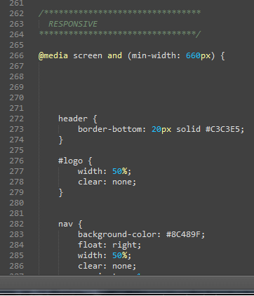
A handy tool within CSS which makes responsive design not just possible, but easy to do is the media query. The media Query looks something a little bit like this ‘@media screen and (min-width: 660px){}’. However there are many variations available depending on how you would like to trigger your media query. This query for example is triggered when the screen width goes above 660px.
Media queries have the facility to react to different media types. A media type can be braille, projection, screen, or many more. In my example I have chosen to use ‘screen’, however if the type is not specified the default value of ‘all’ will be used.